Europe
Lifestyle
Illustration
Print Design
Brussels, Belgium
Urbana-project
2017
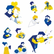
60 artists from across the European Union attempted to answer with an image, what exactly ‘European identity’ means for them.
Each artwork was printed on banners and places in different areas of the European neighborhood, Brussels, during the Iris Fest under the Mixity Brussels 2017 project.
the illustration represents the diversity that you may find in this city. I have always seen Brussels as a multicultural city. This is the reason why I wanted to illustrate what I saw. I started with the main character, then added another, and so on. Until I managed to create all the characters, a silhouette in the shape of a heart.
You may see, characters with different professions and ages, from doctors to artists, young and adults, sports enthusiasts and students, couples, mothers, and children.
One advantage of this geometric style of illustration is that it allows me to keep adding lines and creating characters as I go on.

27 characters from different backgrounds and ethnicities were created, performing many of the activities this city has to offer.
The color palette comes from the same European Union Flag. Since I had to answer with an image, what was the European identity to me? I decided to use only blue and yellow, so I could unite all characters under one flag. If you like to see some pictures of the expo and the work of the other artists. Visit Urbana Project


You can email me at info@ninaposadas.com
or fill out de contact form.
human Resources
B2B
Character Design
Illustration
Whatsapp Stickers
Spain
As human beings, we have a constant impulse to seek knowledge and move towards the future. That innate curiosity that distinguishes us from others leads us to discover, learn, improve and grow as human beings.
The new identity proposal represents an evolution for the company, and part of this evolution had to be their brand character. This new character will help Criteria connect with its target audience and maintain that human and closeness value that characterizes them.
I created the new brand’s character: Sofia.
As human beings, we have a constant impulse to seek knowledge and move towards the future. That innate curiosity that distinguishes us from others leads us to discover, learn, improve and grow as human beings.
Criteria’s primary mission and commitment are to help their clients reach their full potential, hence becoming healthier, more ethical companies with the best talent on their team. Thanks to their consulting services, training programs, and corporate wellbeing projects, Criteria is helping organizations and companies grow stronger and consciously.
This impulse and curiosity was the fundamental basis for creating the new identity proposal for Criteria, designed by Rodrigo Heredia.


The first step in creating a brand character is to define its personality, ambitions, and characteristics.
To describe Sofía, we answered the following questions:
By describing Sofia, we describe Criteria. Which will allow us to create a brand character that establishes closer and human connections with their users and represents the company’s values.


Four different illustrations of the character. The idea was to draw situations and activities that were versatile enough to be used on different applications.


Stickers are communication tools that help us express our emotions in conversations where we cannot observe body language. These emoticons are designed for those virtual conversations to become a little more human, and that is why they visually represent situations, expressions, and attitudes that we all do.
With Criteria, we have gone a step further, designing a set of personalized stickers with Sofia, the brand’s character to be used on a communication platforms such as WhatsApp.
Ten expressions of Sofia with which we can all identify.


You can email me at info@ninaposadas.com
or fill out de contact form.
B2B
Lifestyle
Branding
Illustration
Packaging
Branding collaterals
Spain
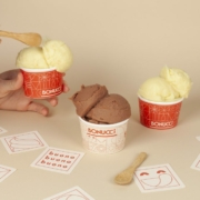
Photography by Cassandra Stuyt
Project made as co-founder at ÁRBOL Creative Studio. Barcelona, Spain. 2019-2020
Bonucci is an ice-cream brand, based in Barcelona, Spain. Its personality is built on the ideas of sharing a fun, dynamic, playful experience to every consumer.
Bonucci needed their new visual identity that represented their experience.
Taking the square as a base module, we illustrated a set of 54 clean, simple, and line drawn illustrations. Classified into 5 main pillars: Happy characters, Ice-cream forms, summer landscapes, typographic expressions, and geometric connecting shapes.
Taking the square as a base module, we illustrated a set of 54 clean, simple, and line drawn illustrations. Classified into 5 main pillars: Happy characters, Ice-cream forms, summer landscapes, typographic expressions, and geometric connecting shapes.
When these illustrations where put together over a baseline square grid, the design came to life. A number of possibilities and different combinations became available to be used in every single application, thus giving the brand a versatile look and feel that represented their unique and fun personality.
Bonucci
Fun, playful, and buono!


You can email me at info@ninaposadas.com
or fill out de contact form.